MARNOR INVESTMENT PARTNERSHIP LLP
LET YOUR MONEY EARN YOU THE PROFIT YOU DESERVE
MARNOR INVESTMENT PARTNERSHIP TECHNICAL ANALYSIS
INTRODUCTION TO TECHNICAL ANALYSIS
Definition
Technical analysts believe that:
The balance of supply and demand, or market action, is the root of price setting.
A thing is worth what it can be sold for.
"The Averages Discount Everything" (one of the principles of Dow Theory).
All hopes, fears and knowledge, including reasonable expectation, is discounted or incorporated in the current price.
Studying the price is all that is necessary.
General Technical Analysis Papers
Taxonomy
Bar Charts, gaps, islands, key reversals. Defining price objectives from gaps and patterns on bar charts. Arithmetic versus logarithmic scales.
Moving Averages, arithmetic, weighted and exponential. Centered, non-centered and advanced. Single, double and multiple moving average crossovers. Moving envelopes, including Bollinger bands. Candle Charts and candle patterns. etc, etc. etc and the list goes on and on and on. Who want to know all about this anyway.
We used a few of the many chart patterns analysis carefully so that we dont have analysis paralysis.
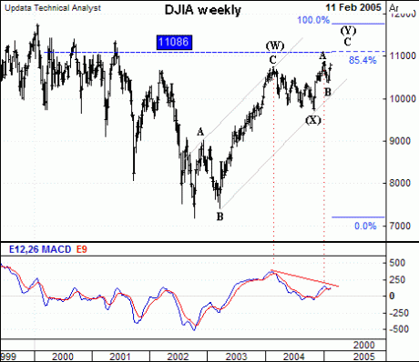
ELLIOT'S WAVE THEORY
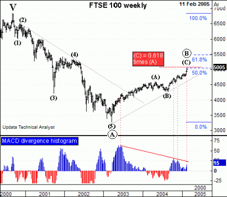
Above is a chart of the Footsie, it is going to hit the 5050 (5058 to be precise) target which would be a 50% retracement of the bear market, starting from the September 2000 high. (This is called the Fibonacci 50% retracement. If we start from the December 1999 high it's 5114. When it reaches that level, wave (C) of the bounce will be a golden ratio of 0.618 times wave (A) of the bounce. So around that level is a possible top for the whole bull market. However, we can't rule out that the bounce might find some extra legs from somewhere and make it to 5500, close to where wave (C) will be equal to wave (A), and the 61.8% golden ratio retracement. At the moment there's no clear indication in the market as to whether it will or it won't, but a marker will probably appear before too long. Measuring the upside momentum, by means of the MACD divergence histogram, shows that upside momentum is steadily declining, and even the surge of the last two weeks hasn't broken the down trend. Nothing has happened to change the analysis that it's all a bear market bounce.
MACD is one of the technical indidcators used in correlation with technical analysis.
Above there is an upward channelling between line AC and BX of the peaks and throughs. From a TA point it will remain bullish unless it brakes the line BX. This index can be traded within this channel. where the share price just touches at X we can buy the index and sell if it bounces off the the line AC. This is roughly 1800 points movement.
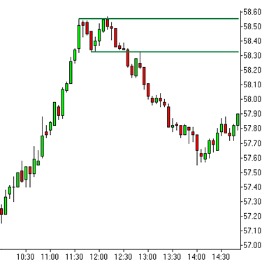
DOUBLE TOPS & (BOTTOMS)
Double tops and double bottoms are common chart patterns that occur frequently both intraday as well as over a number of days or weeks. They are classed as "reversal" patterns as they signal the end of the current trend and beginning of a new trend in the opposite direction.
Notice that the share price makes a double TOP and down it came.
HEAD AND SHOULDERS
Head and shoulders are popular and well known chart patterns that occur both intraday as well as over a number of days or weeks. They are classed as "reversal" patterns as they signal the end of the current trend and beginning of a new trend in the opposite direction.
The name "head and shoulders" is derived from the shape of the formation. A head and shoulders top is made up of three price swing highs, with the middle price swing high, the "head", being at a higher price than the two high price swings on either side, the "shoulders". A head and shoulders bottom is the same as a head and shoulders top but in reverse.
Notice the chart makes a head and shoulder pattern
and up the share price went. If the price is going up a top head and shoulder could occur. The share price would come down instead.
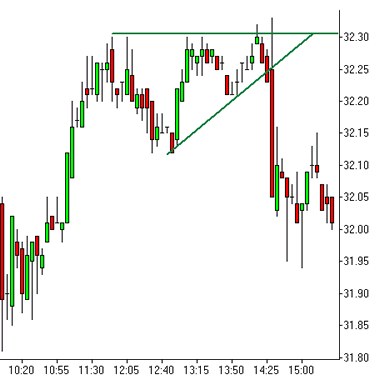
TRIANGLE REVERSAL BREAKOUTS
There are many different triangle formations. The name "triangle" is derived from the shape of the pattern. Looking at the two charts below, it will become clear how these formations got their names. We focus on ascending and descending triangles. Ascending triangles look like right angled triangles that slope up, descending triangles look like right angled triangles that slope down. In this section, we will look at triangle reversal patterns.
CUP AND HANDLE
The name "cup and handle" is derived from the shape of the pattern. You may notice that the left hand side of the pattern looks like a big "cup" and the small right hand side of the pattern looks like a "handle"!
A cup and handle rising breakout is formed as follows: As a stock advances, it reaches a price level where a large concentration of sellers exist. As the number of sellers outweighs the number of buyers at this level, prices retreat. As the price retreats, new buyers who had previously missed out on buying the stock on the previous advance enter the market to buy the stock. When the number of buyers outweighs the number of sellers, the stock stops falling and once more advances.
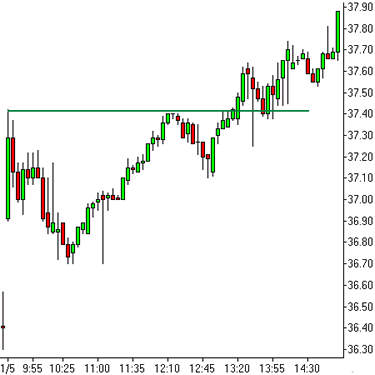
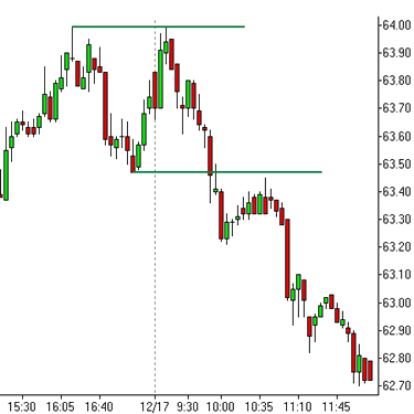
SUPPORT AND RESISTANCE
Support and resistance are very important concepts in technical analysis. Edwards and Magee in their superb book "Technical Analysis of Stock Trends" described support as "buying, actual or potential, sufficient in volume to halt a down trend in prices for an appreciable period". They noted that "a support level is a price level at which sufficient demand for a stock appears to halt a down trend temporarily at least, and possibly reverse it".
By analysing the strength of previous support levels, technical traders can anticipate the potential of those support levels to halt and reverse price declines when those levels are approached in the future. Support levels represent a range of prices where a concentration of buyers exist who are of the opinion that the stock represents good value at that price level. Seeing this level cause prices to reverse and advance in the past, potential buyers of the stock may now also view the same level as good value for the stock, thus adding to buying pressures at those levels and strengthening the level of support in the future.
Here is a typical example of support Here is an example of a resistance prior day high on a five minute chart of SIE, a Xetra stock, dated 17th December 2003 prior swing high on a daily chart of RNO,
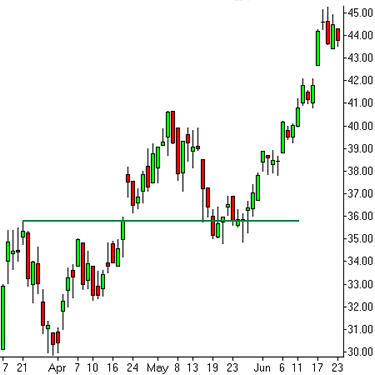
a French CAC40 stock for 2003.
The stock initially met resistance at the
whole number 36 Euros at the end of March.
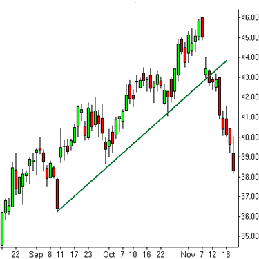
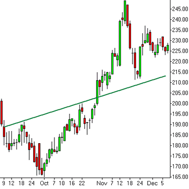
TRENDLINES (THE TREND IS OUR FRIEND)
A trend may be defined as a series of price movements that take prices higher or lower than at the start of the movement. Trends may be defined as “uninterrupted” where all price movements for each period are in the same direction, or “interrupted” where they are composed of a mixture of rising trends, falling trends and no trends during the life of the price movement.
Almost all trends of more than ten periods will be “interrupted” in nature. In other words, they are composed of a mixture of shorter term trends which work together make the longer term trend. It is this “additive” nature of trends which allows technical traders to draw what are termed as "trendlines".
TECHNICAL INDICATORS
A large number of mathematical technical indicators have been developed by technicians to assist traders in identifying trends, measuring price momentum and identifying overbought and oversold conditions.
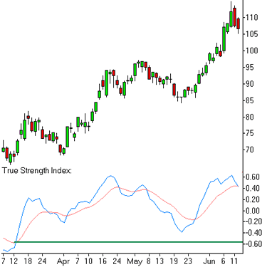
Our favourite indicator is the True Strength Index developed by William Blau. This is a double smoothed moving average based indicator providing smooth and timely indications of price momentum and overbought/oversold conditions. Another popular indicator is the Relative Strength Index (RSI) developed by Welles Wilder. This also can provide good indications of price momentum and overbought/oversold conditions.
As oscillators, both the TSI and RSI, oscillate around a mid point. Any reading above the mid point indicates bullish conditions whilst any reading below the mid point indicates bearish conditions. In range bound or non trending markets, the TSI and RSI can provide good indications for when a stock is regarded as "overbought" or "oversold". An extreme bullish reading on the TSI or RSI can indicate an overbought condition whilst an extreme bearish reading can indicate an oversold condition
This is over simplified. TECHNICAL ANALYSIS can be much more complicated and tedious. This provides a narrow introduction to technical analysis and technical indicators.


The triangle is formed and if the price move down and break that support line, that's a sell signal